
7 font pairings that make a website look expensive
Seven font pairings that make a website feel premium, from real designs: where each works, why it looks expensive, and how to use it well.
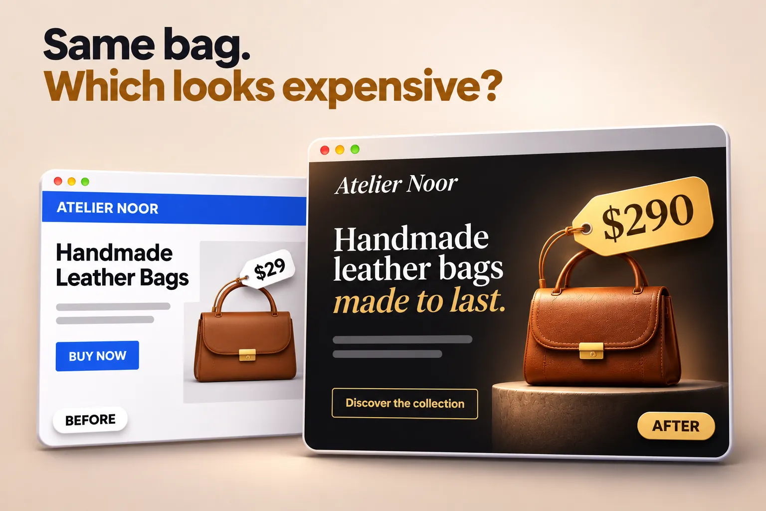
Expensive-looking websites rarely use expensive fonts. They use two good fonts, with care: large, calm headings, easy text and plenty of space. The fonts themselves are often free.
Here are seven font pairings from real website designs. Each one is a style in PageCore’s Style Library and is used by a live starter site, so you can see it at work, not just in a font sample.
In short
- A premium look comes from contrast: an elegant heading font with a quiet, readable text font.
- Use two fonts at most, and only two or three weights.
- Give headings room: large sizes, short lines, generous spacing.
- Serif headings feel classic; clean sans-serifs feel modern and confident.
- All seven pairings are free Google Fonts that you can host on your own site.
1. Playfair Display + Inter
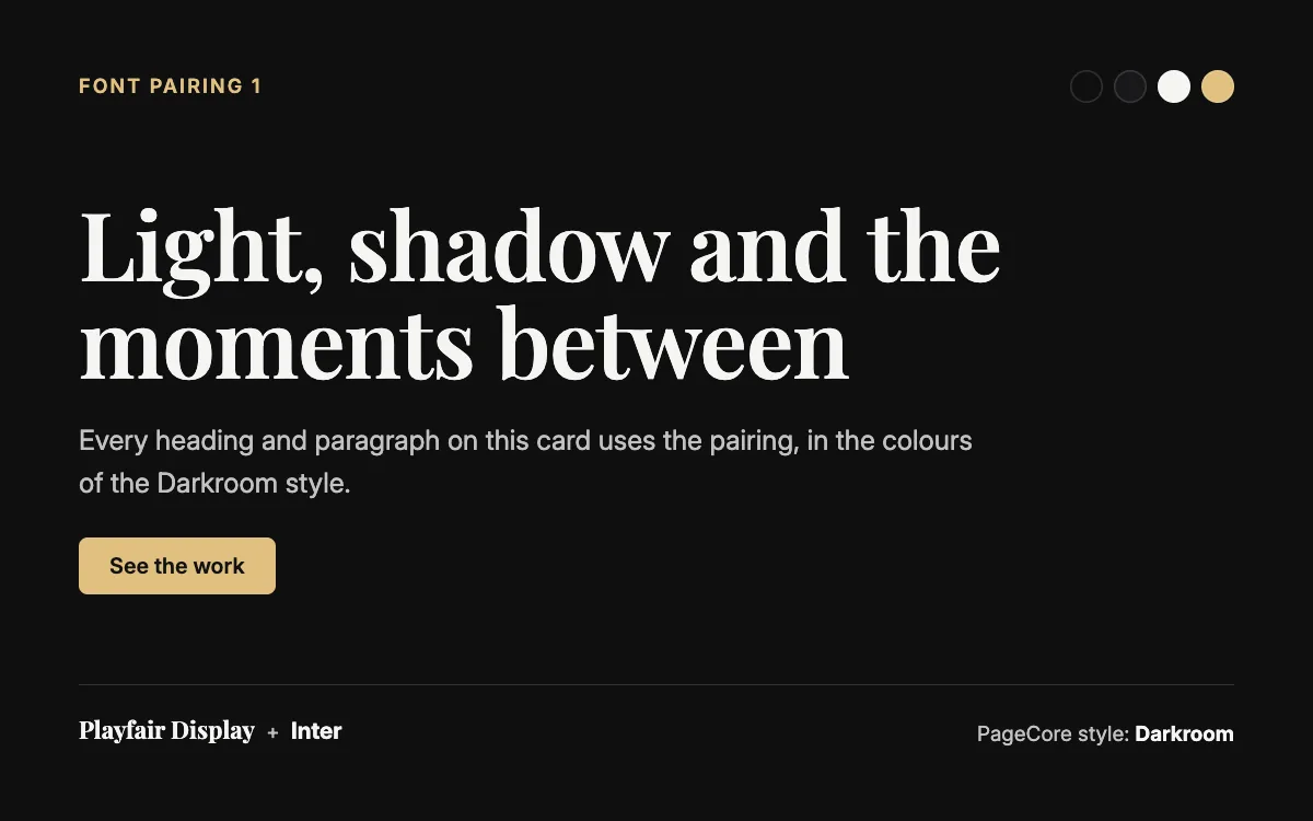
Playfair Display has a strong contrast between thick and thin strokes, the look of fashion magazines and gallery walls. Inter is a calm text font made for screens, so the headline gets all the attention.
- Best for: Photographers, fashion, beauty, galleries and luxury venues.
- Tip: Use Playfair big (40px and up): its thin strokes disappear at small sizes. On a dark background, as in the Darkroom style, a slightly heavier weight keeps it crisp.
- See it live: the Darkroom style, used by Photography Studio 1.
2. Cormorant Garamond + Lato
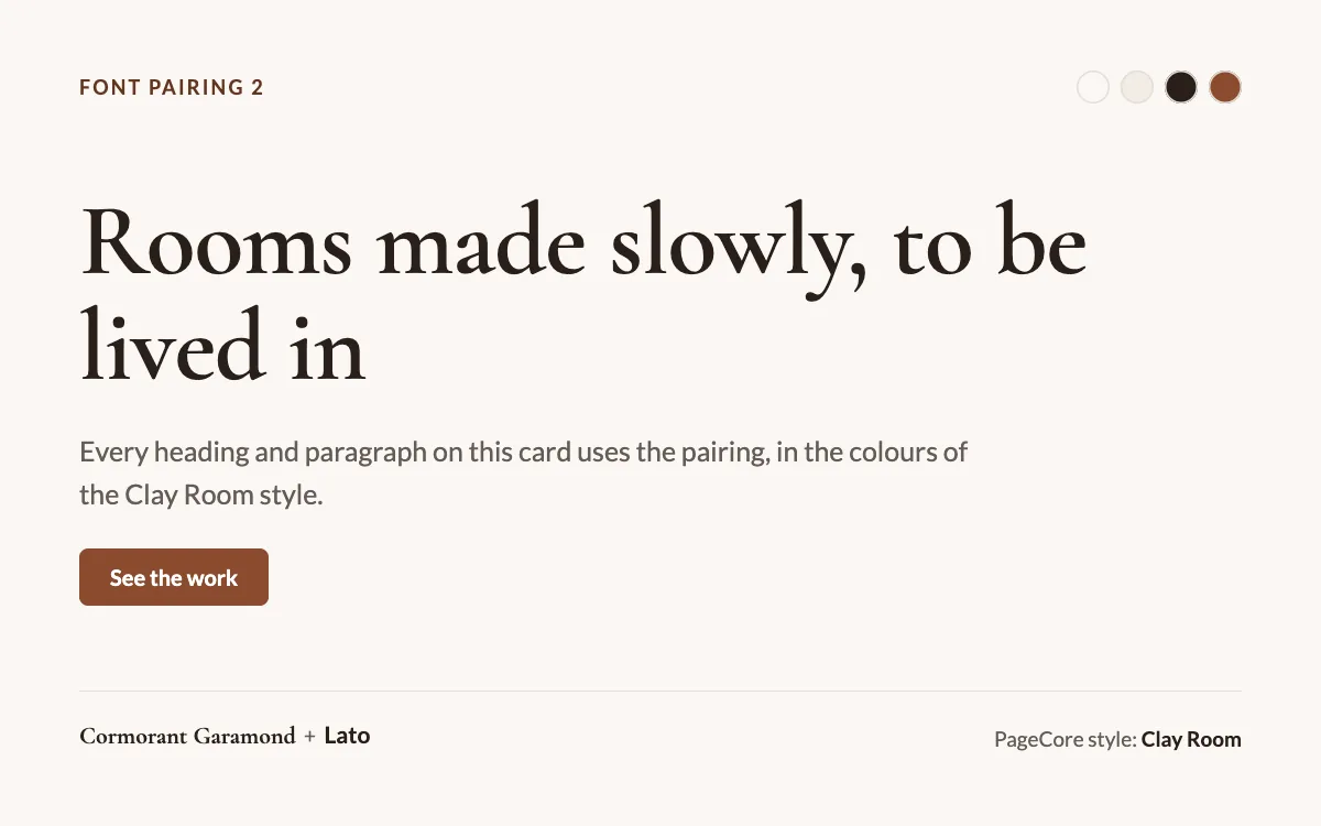
Cormorant Garamond is tall, light and refined, with the feel of a printed catalogue. Lato is round and warm, which keeps the whole page friendly.
- Best for: Interior designers, architects, jewellery, boutique hotels and fine dining.
- Tip: Cormorant looks smaller than other fonts at the same size, so set it larger than usual, and never use it for long text.
- See it live: the Clay Room style, used by Interior Design 2.
3. Fraunces + Inter
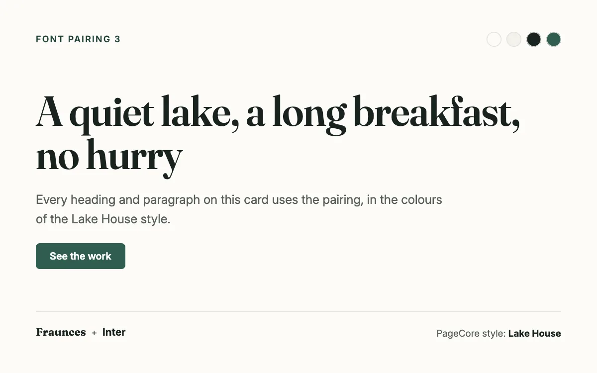
Fraunces is a soft serif with personality: slightly old-fashioned, a little playful, clearly crafted. Next to plain Inter it feels warm rather than formal.
- Best for: Hotels, restaurants, wellness, bakeries and food brands.
- Tip: Fraunces shows its character at medium and heavy weights. Keep it for headings and short lines.
- See it live: the Lake House style, used by Hotel & Resort 1.
4. Libre Baskerville + Open Sans
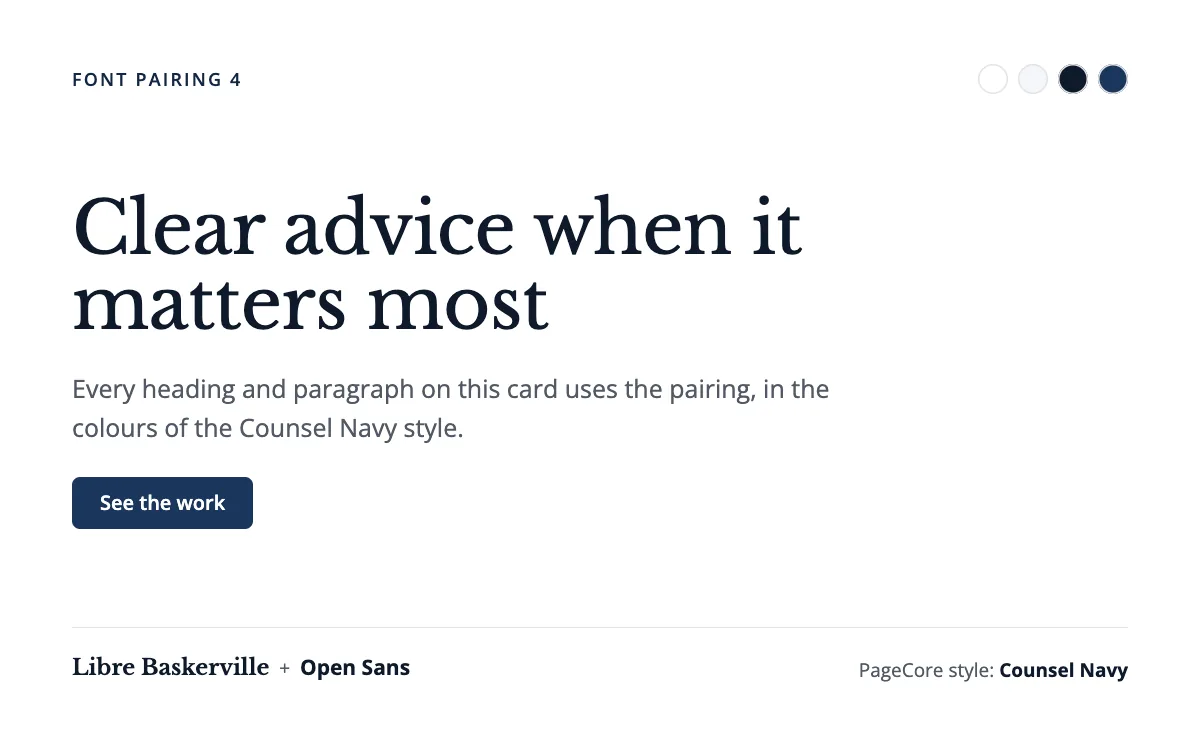
Libre Baskerville is a classic book serif. It says tradition and care without trying hard. Open Sans keeps long paragraphs easy to read.
- Best for: Law firms, accountants, consultants, schools and charities.
- Tip: Use the regular weight for headings: Baskerville gets heavy in bold. Give it plenty of line spacing.
- See it live: the Counsel Navy style, used by Law Firm 1.
5. Instrument Sans
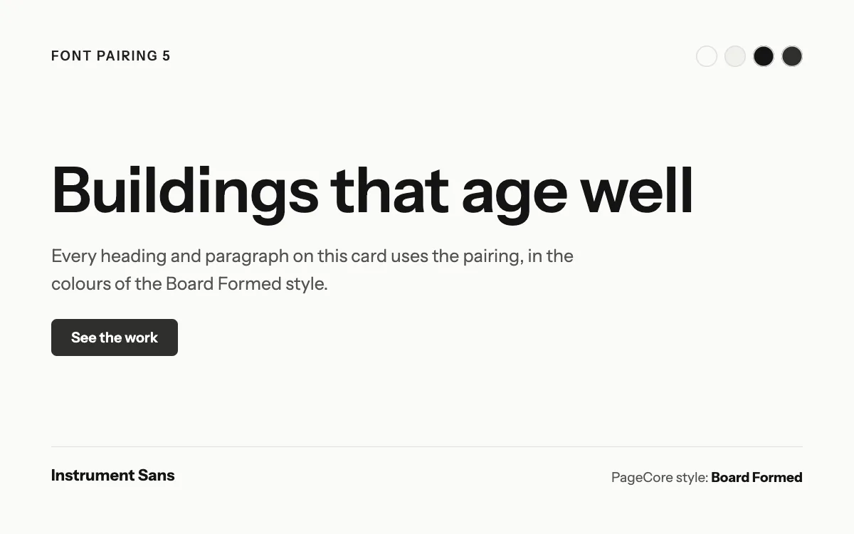
Proof that one font can look premium. Instrument Sans is crisp and modern; size and weight do all the work, and the page stays calm.
- Best for: Architects, design studios, product brands and galleries.
- Tip: Tighten the letter spacing a little on large headings, and use only two weights.
- See it live: the Board Formed style, used by Architecture Firm 1.
6. Domine + Nunito Sans
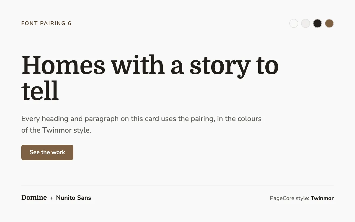
Domine is a sturdy serif made for screens; Nunito Sans is soft and rounded. Together they feel premium but approachable, never cold.
- Best for: Interiors, real estate, family firms and local premium brands.
- Tip: Domine stays readable at smaller sizes than most display serifs, so it also works for subheadings.
- See it live: the Twinmor style, used by Interior Design.
7. Epilogue + Inter
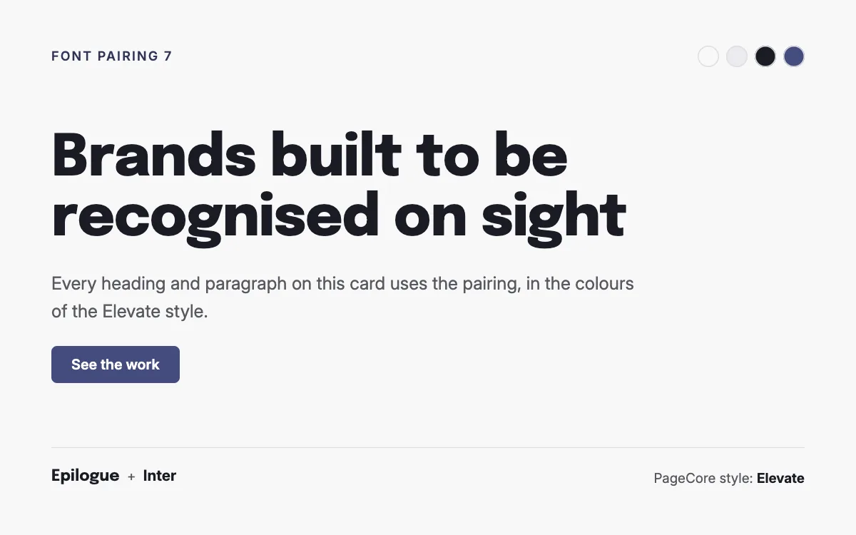
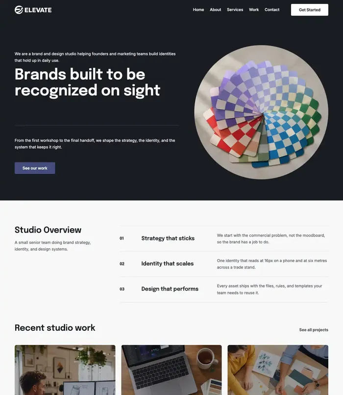
Epilogue is a confident sans-serif with character in its heavy weights. With Inter for the text it looks modern, sharp and expensive in a tech way.
- Best for: Agencies, studios, startups and software.
- Tip: Use 700 or 800 for headings with slightly tight letter spacing; keep the text at a normal weight.
- See it live: the Elevate style, used by Agency 2.
How to make any pairing look expensive
- Two fonts at most. One for headings, one for text. One font alone can be enough.
- Two or three weights. Regular and bold for text, one weight for headings.
- Big, short headlines. Three to seven words, set large, with tight line height.
- Comfortable text. 16 to 18 pixels on screens, about 1.6 line height, lines of 60 to 75 characters.
- Space. Premium designs leave room around headings, pictures and buttons.
- One accent colour for links and buttons; the fonts do the rest.
- Host the fonts on your own site. One server less to wait for, and visitors’ browsers do not have to contact another company to show your text.
Try them on your own site
Each pairing above comes with a whole style in PageCore: fonts, colours and spacing together. In the Style Library you can switch your site’s look in one click and switch back just as fast, and every starter site comes with its style already set.
Questions
Are these fonts free for business websites?
Yes. All of them are on Google Fonts under the SIL Open Font License, which allows commercial use.
Serif or sans-serif for a luxury website?
Both work. Serif headings feel classic and crafted; a clean sans-serif feels modern and confident. Choose the one that matches how your brand talks.
How many fonts should a website use?
Two at most: one for headings and one for text. Many premium sites use a single font in two weights.
Should I load fonts from Google or host them myself?
Hosting them on your own site saves a connection to another server and keeps visitors’ requests on your site. WordPress’s Font Library can install Google Fonts on your own site for you.
Sources

Keep reading
Design
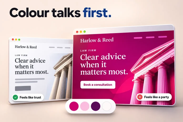
Colour palettes for 10 industries, from real website designs
Ten website colour palettes, one per industry, from real designs: the four colours of each, why they work and the starter site that uses them.
Design
5 fonts that make restaurant websites feel warm and welcoming
Five fonts that make a restaurant website feel warm and inviting, with real examples, the text fonts to pair them with and tips for readable menus.
AI and the web
AI agents are starting to use websites. Is yours ready?
AI assistants now open websites, fill in forms and compare options for people. What they need from your site, and a 10-point check to get ready.