
5 fonts that make restaurant websites feel warm and welcoming
Five fonts that make a restaurant website feel warm and inviting, with real examples, the text fonts to pair them with and tips for readable menus.
A restaurant website should feel like walking through the door: warm, welcoming and a little hungry-making. Fonts do a lot of that work before anyone reads a word.
Here are five heading fonts that make restaurant sites feel warm, each shown in a real PageCore style with the text font it is paired with, plus what to use on the menu itself.
In short
- Warm restaurant sites usually pair a characterful serif for headings with a plain, readable font for menus.
- DM Serif Display, Fraunces, Playfair Display, Cormorant Garamond and Lora all bring warmth in different ways.
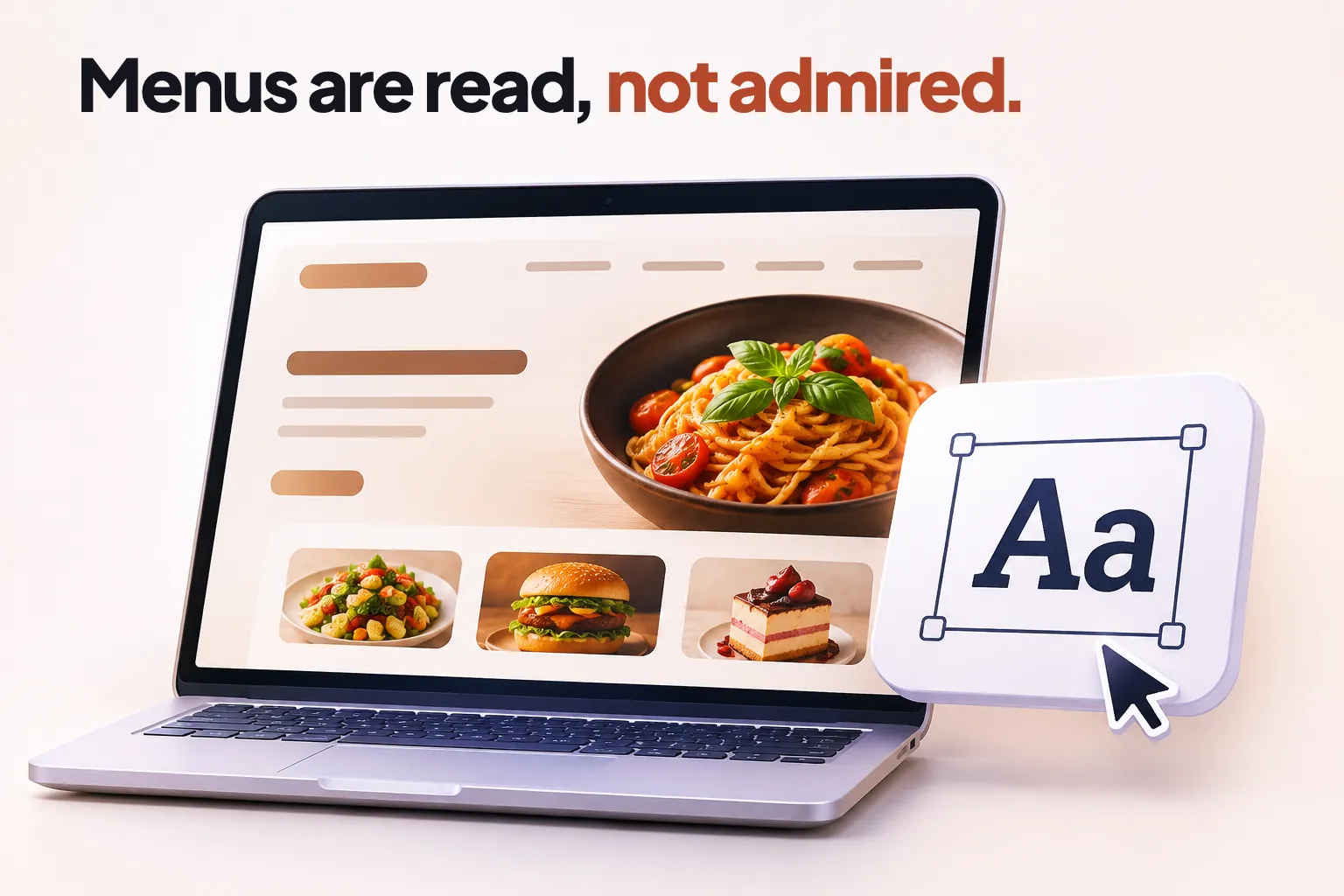
- Menus are read, not admired: dishes and prices need a clear text font, at least 16 pixels on phones.
- Avoid script and handwriting fonts for anything longer than a few words.
- All five fonts are free and can be hosted on your own site.
1. DM Serif Display
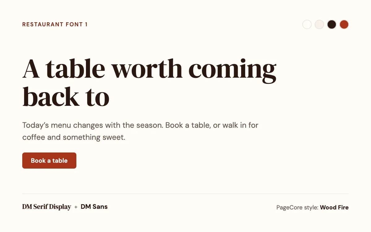
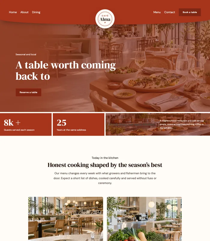
A bold serif with soft, rounded curves, like a hand-painted shopfront. It feels generous and homely, and DM Sans keeps the menu clean and easy to read.
- Pair it with: DM Sans for the menu and longer text.
- Best for: Neighbourhood restaurants, bistros, cafés and bakeries.
- See it live: the Wood Fire style, used by Restaurant & Café 1.
2. Fraunces
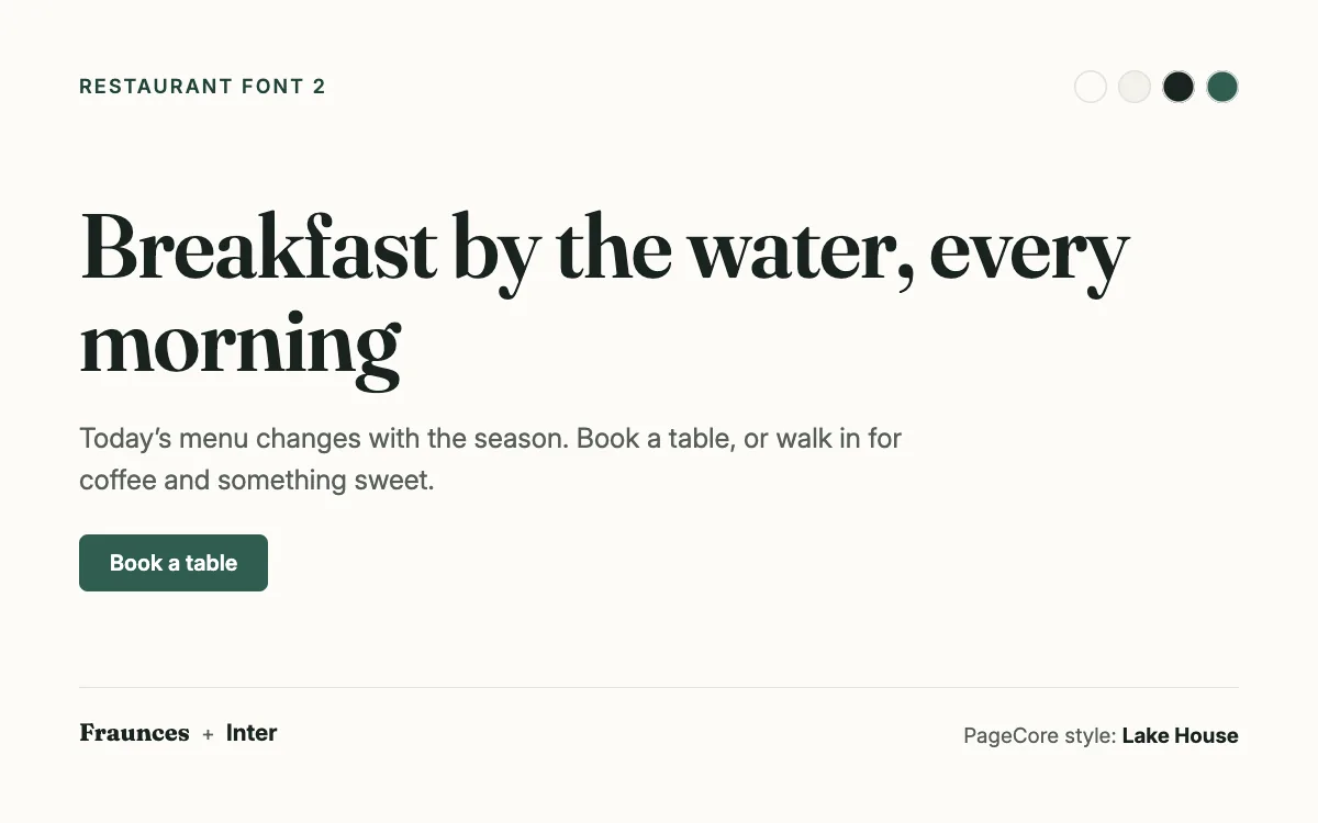
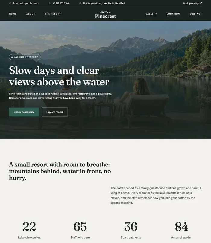
Fraunces has warmth and a little wit: slightly old-fashioned, clearly crafted. It suits places that care about where their food comes from.
- Pair it with: Inter for the menu and longer text.
- Best for: Farm-to-table kitchens, wine bars, bakeries and hotel restaurants.
- See it live: the Lake House style, used by Hotel & Resort 1.
3. Playfair Display
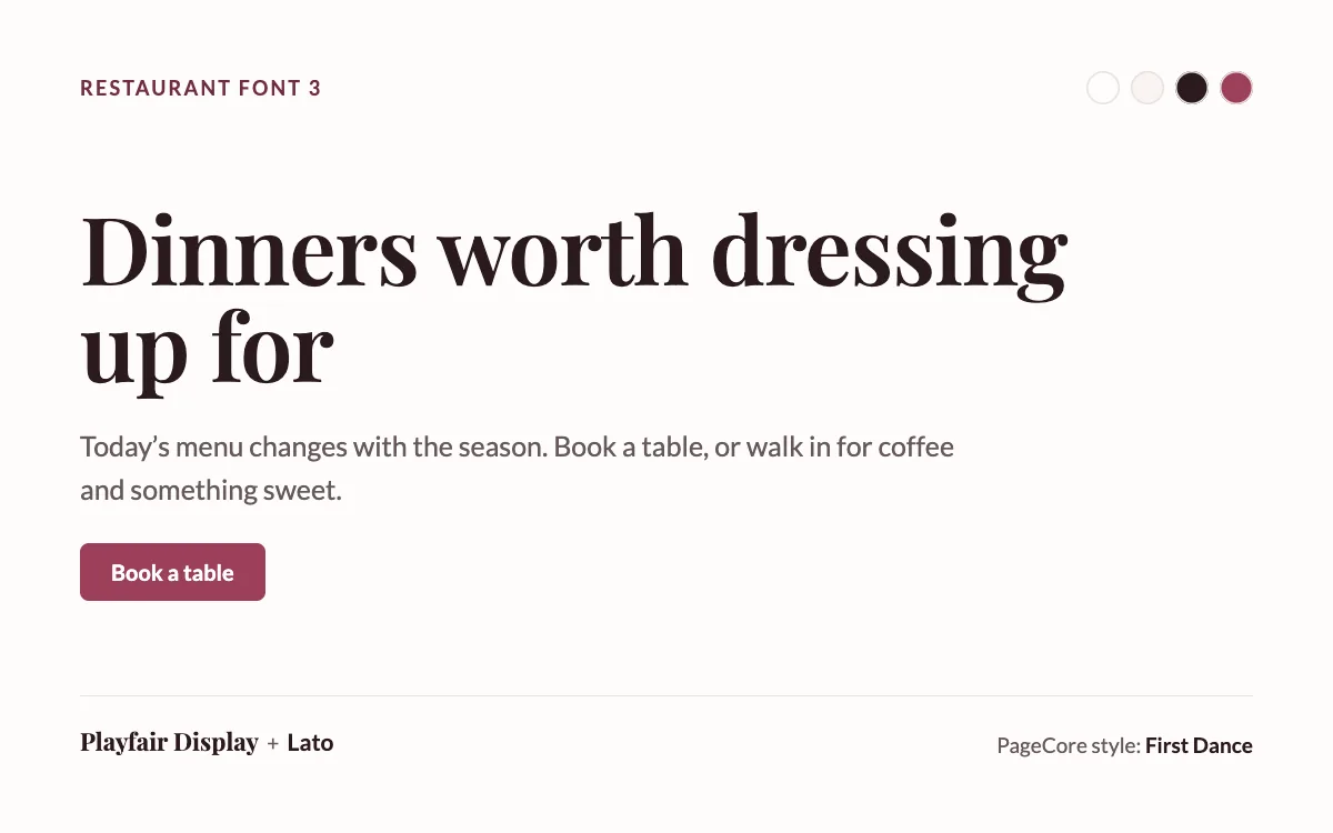
Elegant and high-contrast, Playfair Display brings a sense of occasion. Lato keeps it friendly, so it never feels stiff.
- Pair it with: Lato for the menu and longer text.
- Best for: Fine dining, celebrations, private dining rooms and event venues.
- See it live: the First Dance style, used by Event & Wedding Planning 1.
4. Cormorant Garamond
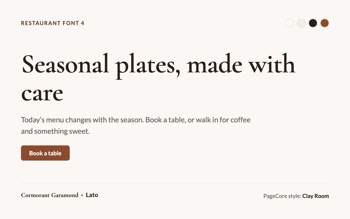
Tall, light and refined: quiet luxury. It works best very large, with lots of space around it.
- Pair it with: Lato for the menu and longer text.
- Best for: Tasting menus, cocktail bars and restaurants with a calm, upscale room.
- See it live: the Clay Room style, used by Interior Design 2.
5. Lora
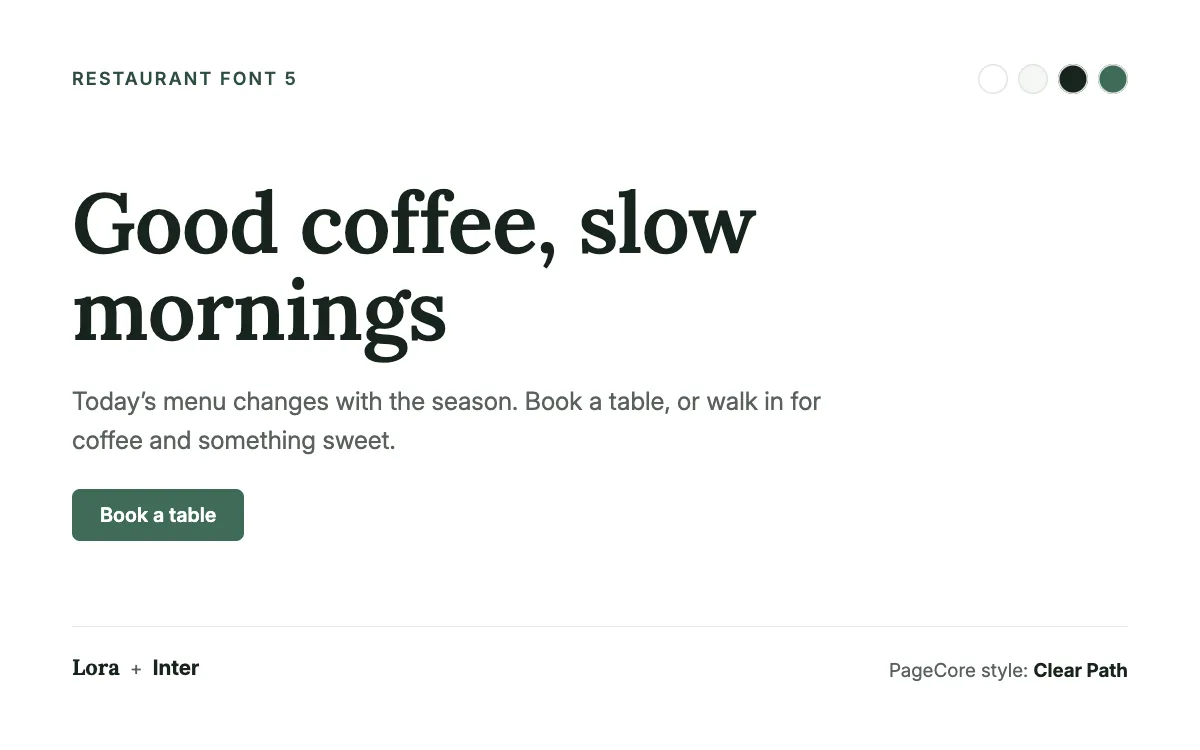
A friendly serif that stays readable even at smaller sizes. It feels honest and relaxed, a good fit for places people visit every week.
- Pair it with: Inter for the menu and longer text.
- Best for: Cafés, brunch places, family restaurants and bakeries.
- See it live: the Clear Path style, used by Life & Business Coaching 1.
Fonts for the menu itself
The heading font sets the mood; the menu has to work. A few rules keep it easy to read on a phone at the table:
- Set dish descriptions and prices in the text font, at 16 pixels or more on phones.
- Dish names can use the heading font if it stays clear at that size; otherwise use bold text.
- Line up prices on the right, or put them straight after the dish name, and do it the same way everywhere.
- Keep script and handwriting fonts for a word or two, never for whole dishes.
- Put the menu on the page as text, not only as a PDF: it reads better on phones and search engines can see it.
Fonts and colours together
Warm fonts look their best with warm colours. The Wood Fire style behind Restaurant & Café 1 pairs terracotta #A6341B with a soft cream background #FFFCF7. For more combinations, see colour palettes for 10 industries.
See them on real restaurant and hospitality sites
Restaurant & Café 1
Restaurant and café
Free
Hotel & Resort 1
Lakeside hotel and resort
Free
Questions
Are these fonts free to use on a restaurant website?
Yes. All five, and the text fonts paired with them, are on Google Fonts under the SIL Open Font License, which allows commercial use.
Can I use a handwriting font for my restaurant’s name?
For a logo or one short word, yes. For menus, opening hours and anything people need to read quickly, use a clear text font.
How big should menu text be on a phone?
At least 16 pixels for descriptions and prices. Dish names can be a little larger or bold.
Can I change my site’s fonts later?
Yes. In WordPress you can change fonts under Appearance › Editor › Styles, and PageCore’s Style Library changes fonts and colours together in one click.
Sources

Keep reading

Design
7 font pairings that make a website look expensive
Seven font pairings that make a website feel premium, from real designs: where each works, why it looks expensive, and how to use it well.
Design
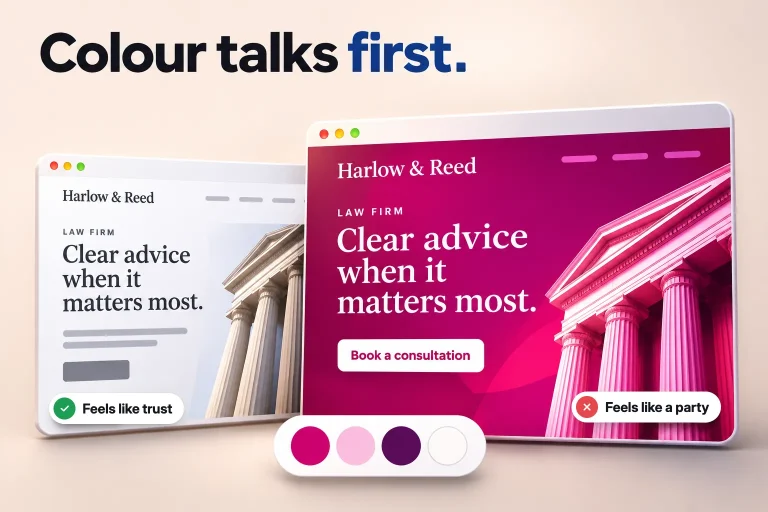
Colour palettes for 10 industries, from real website designs
Ten website colour palettes, one per industry, from real designs: the four colours of each, why they work and the starter site that uses them.
AI and the web
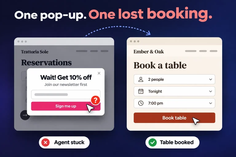
AI agents are starting to use websites. Is yours ready?
AI assistants now open websites, fill in forms and compare options for people. What they need from your site, and a 10-point check to get ready.