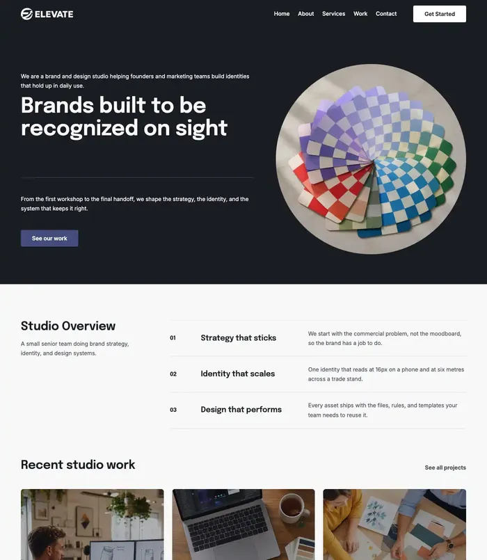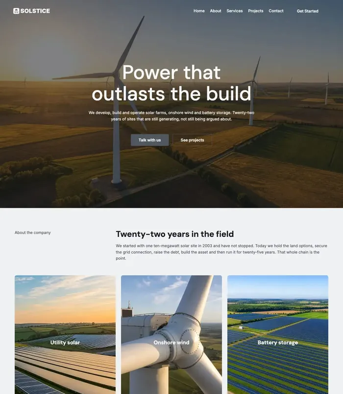

Colour palettes for 10 industries, from real website designs
Ten website colour palettes, one per industry, from real designs: the four colours of each, why they work and the starter site that uses them.

Most good websites need only four colours: a background, a second colour for sections, a colour for headings and one accent for buttons and links. The skill is in choosing the four that feel right for the business.
Here are ten palettes, one per industry, taken from real website designs: each is a style in PageCore’s Style Library and is used by a live starter site. Every colour code is the real one.
In short
- Four colours are enough: background, section, headings and one accent.
- Use the background most, the section colour often and the accent rarely: buttons, links and key details.
- The industry sets expectations: navy for trust, teal for care, terracotta for warmth, yellow for building sites.
- Text needs enough contrast to read: at least 4.5 to 1 for normal text.
- Dark palettes work well for tech, photography and construction, when the accent is bright.
How to read the palettes
Each picture shows the palette’s name in its own heading font and its four colours with their codes, beside the starter site that uses it. Use the codes as they are, or as a starting point for your own brand.
1. Law firm: Counsel Navy
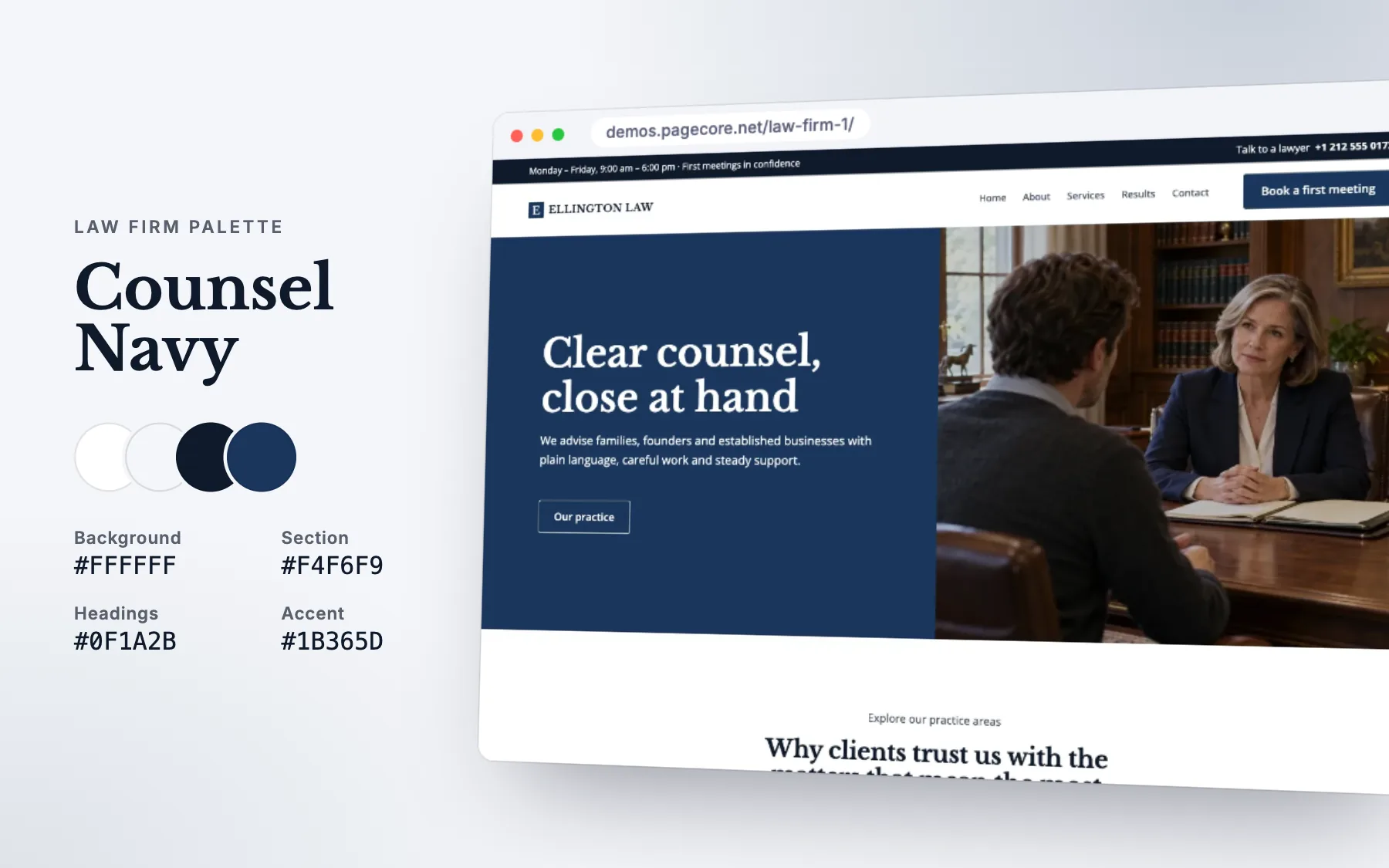
Deep navy says stability and trust; lots of white keeps it calm rather than cold. The accent is used sparingly, which makes every button easy to find.
- See it live: Law Firm 1.
2. Medical clinic: Clear Clinic
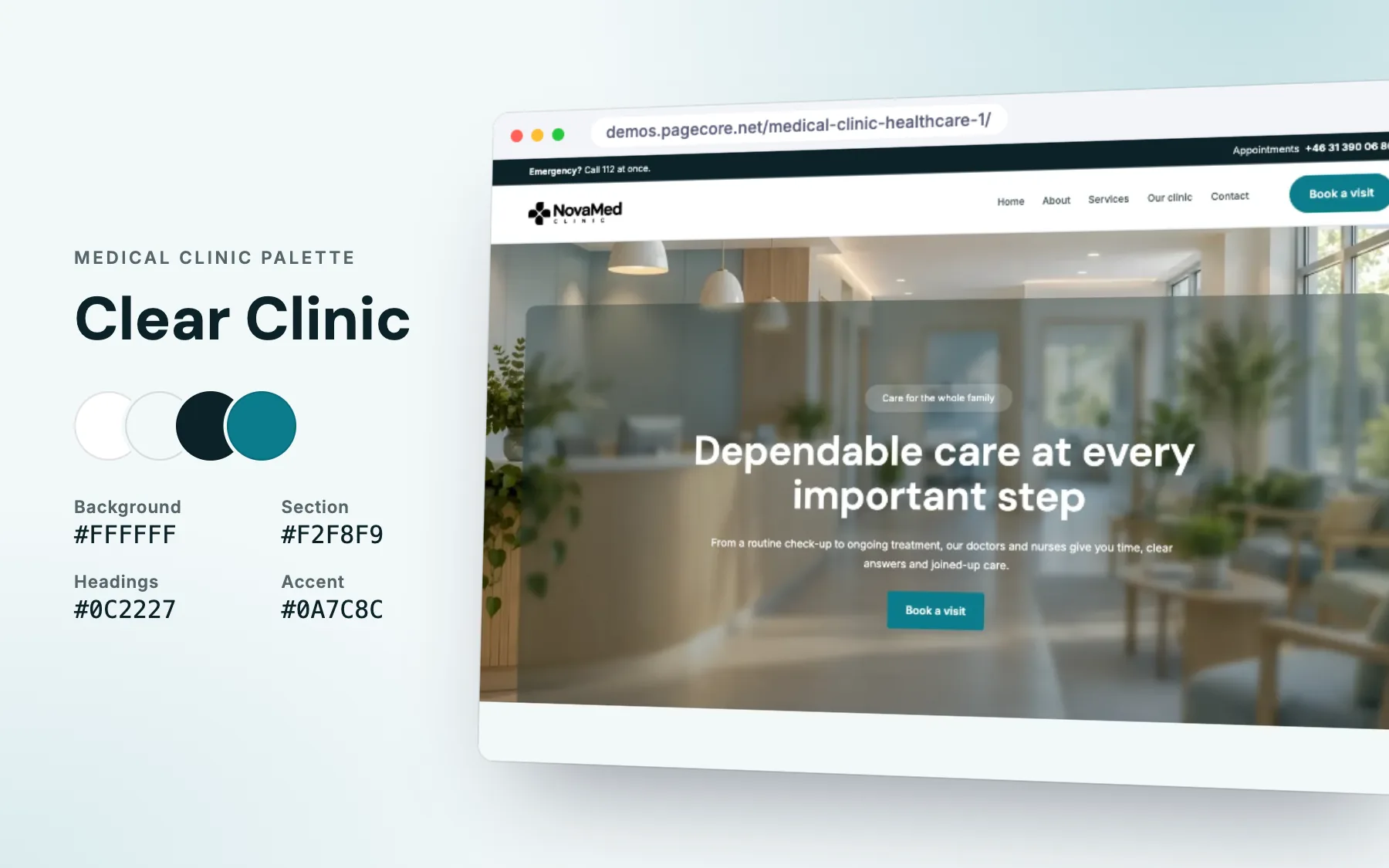
Teal reads as clean and caring without the cold feel of hospital blue. Soft blue-grey sections separate services without boxing them in.
- See it live: Medical Clinic & Healthcare 1.
3. Restaurant and café: Wood Fire
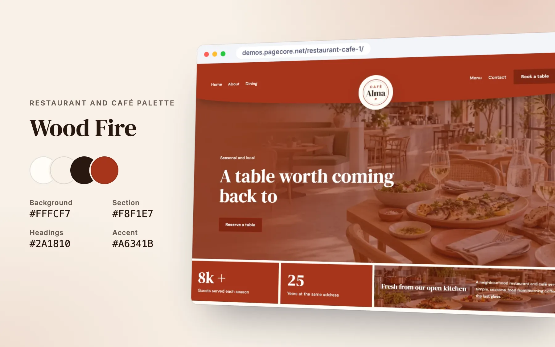
Terracotta and cream feel like warm bread and clay ovens. Dark brown headings are softer than black and keep the warmth.
- See it live: Restaurant & Café 1.
4. Construction: Site Board
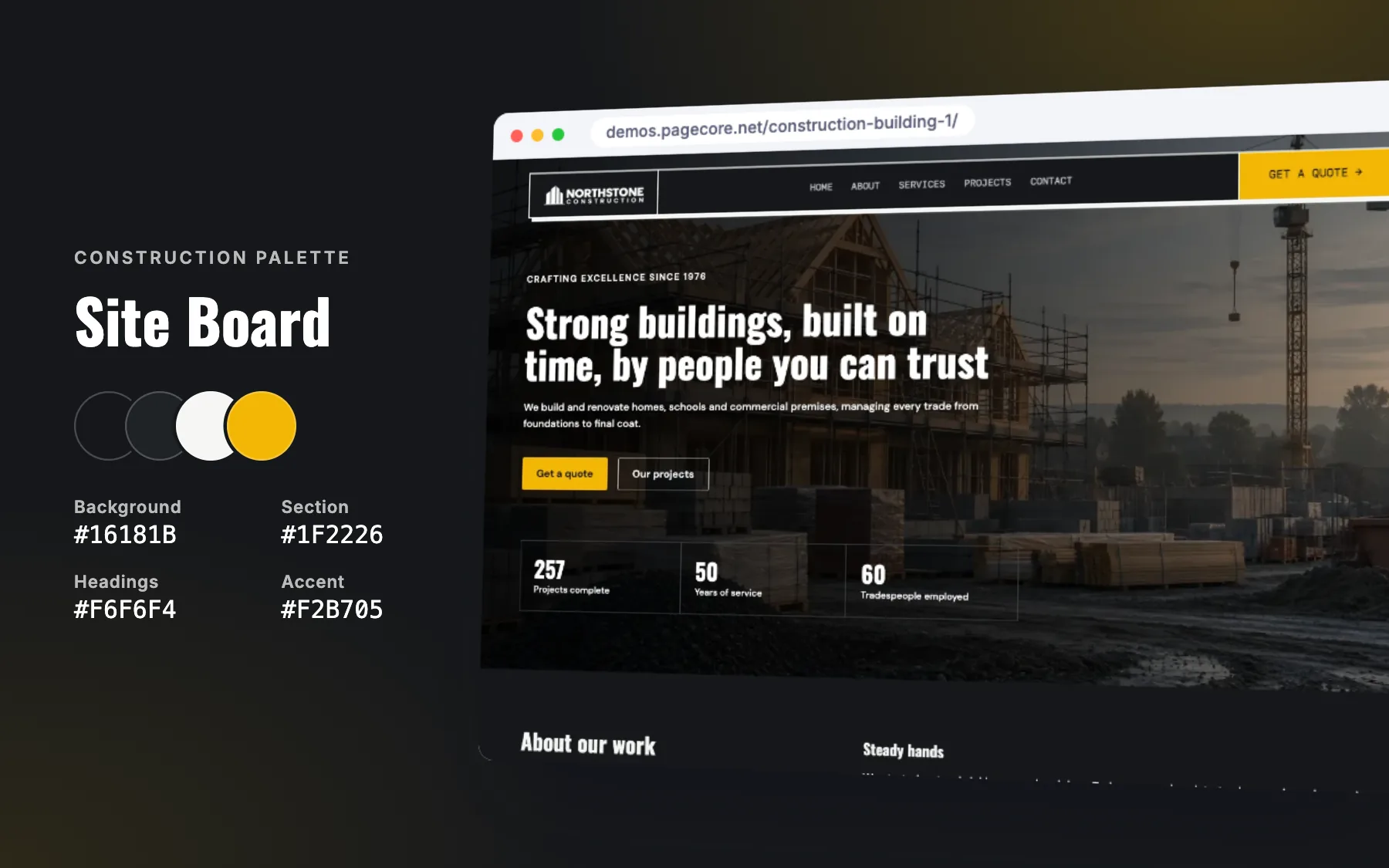
Safety yellow on charcoal is the colour of the building site itself. A dark style feels strong and solid, and the yellow points straight at the next step.
- See it live: Construction & Building 1.
5. Solar and renewable energy: Sunrise Array
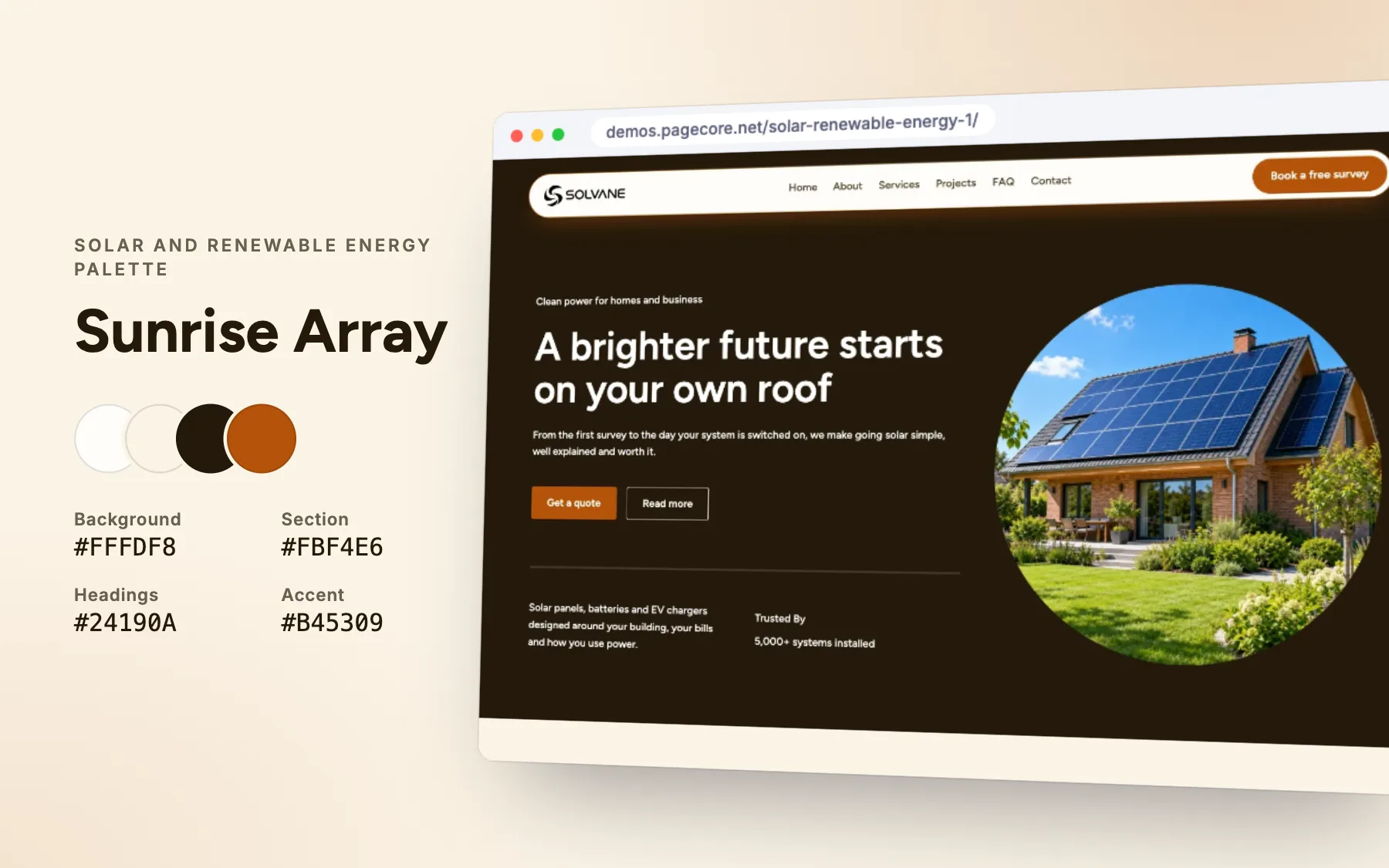
Warm amber suggests sunlight and energy; the warm cream background keeps it optimistic rather than corporate.
- See it live: Solar & Renewable Energy 1.
6. Accounting and finance: Balance Sheet
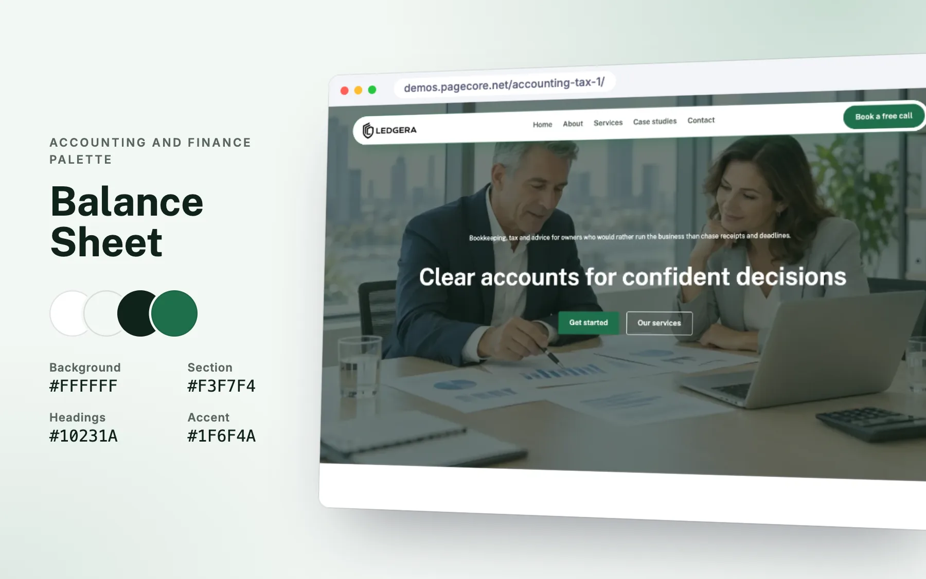
Green is the colour of growth and money done right. Paired with near-black headings it looks precise and steady.
- See it live: Accounting & Tax 1.
7. Weddings and events: First Dance
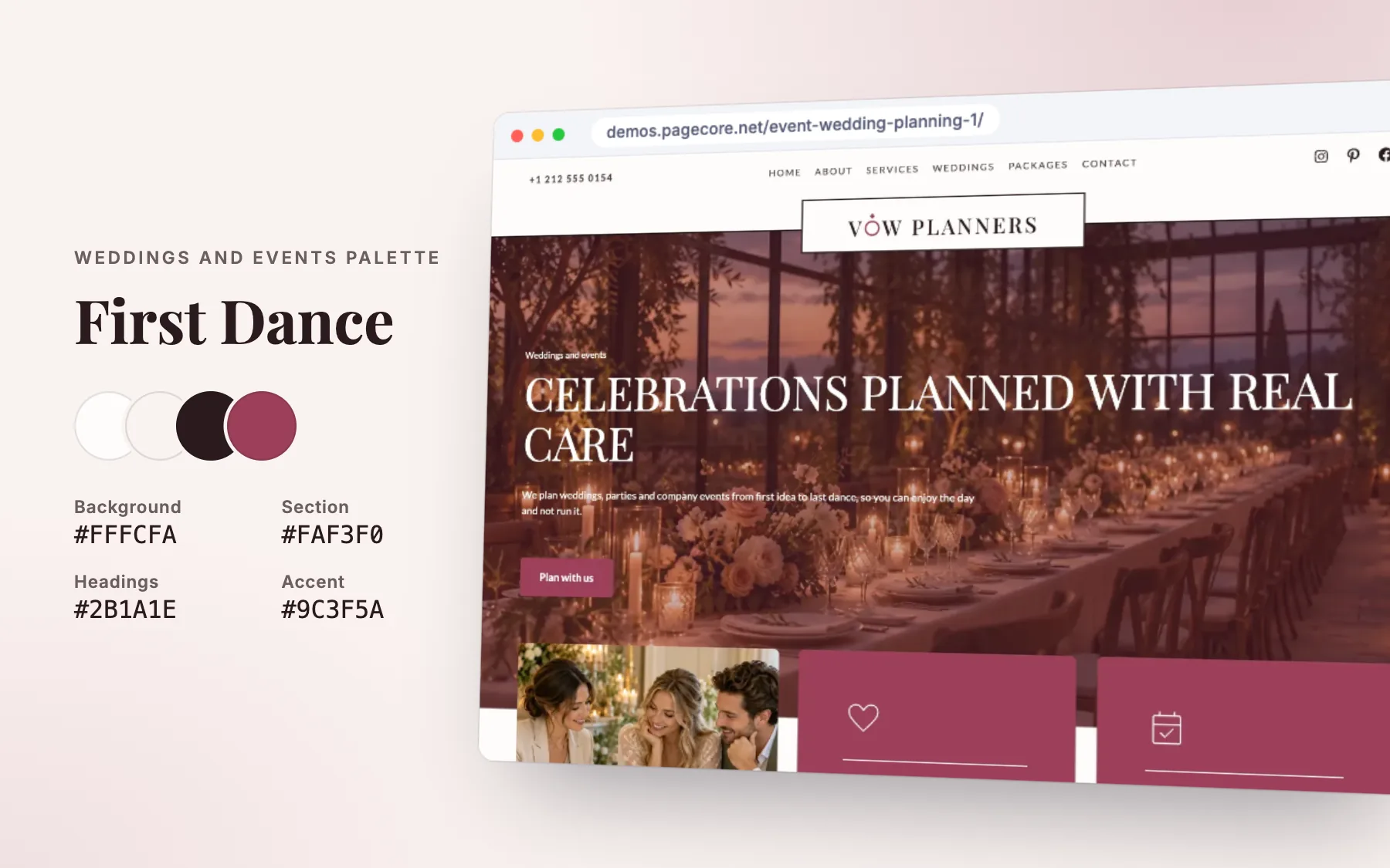
A deep rose feels romantic without being sugary, and the blush-cream background gives photos room to shine.
- See it live: Event & Wedding Planning 1.
8. Hotel and resort: Lake House
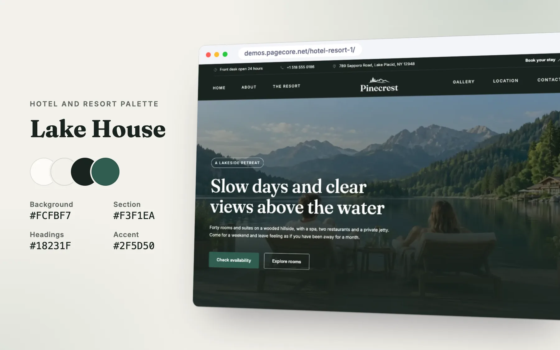
Forest green and warm cream bring nature indoors. It is quiet and grown-up, a good fit for places sold on calm.
- See it live: Hotel & Resort 1.
9. Web hosting and tech: Uptime
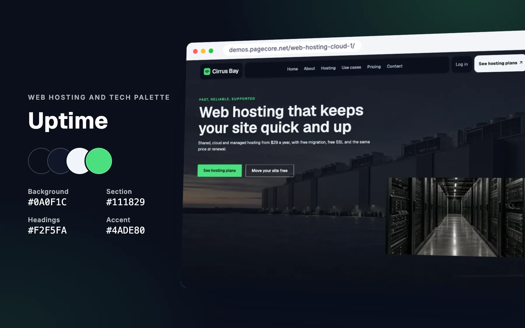
A dark navy page with a bright green accent looks like a terminal and a status light at once: technical, fast and always on.
- See it live: Web Hosting & Cloud 1.
10. Web and creative agency: Pixel Grid
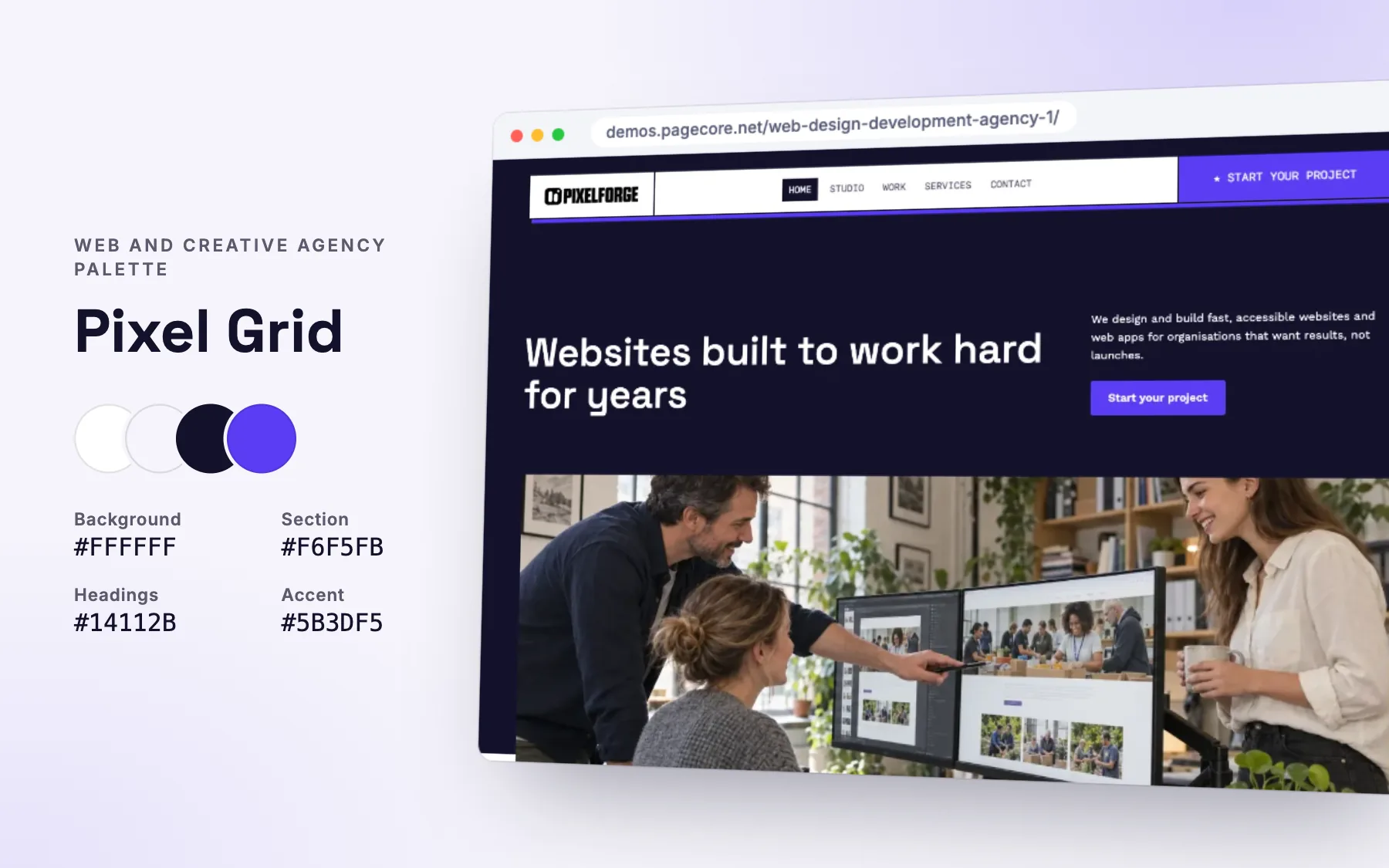
Electric violet is confident and digital, and different enough from the usual blue to be remembered.
- See it live: Web Design & Development Agency 1.
How to use a palette well
- Background about 60%, sections about 30%, accent about 10%. A common rule of thumb that keeps pages calm and buttons visible.
- One accent, used only for actions. If everything is orange, nothing stands out.
- Check contrast. Normal text needs a contrast ratio of at least 4.5 to 1 against its background, large text 3 to 1.
- Test with your photos. A palette that looks great on its own can clash with the colours in your pictures.
- Keep it everywhere. The same four colours on every page, in emails and on social media.
Questions
How many colours should a website use?
Four is enough for most sites: a background, a section colour, a heading colour and one accent. Add a red for errors if you have forms.
Can I use these colour codes on my own website?
Yes. Colours cannot be owned the way logos can, so use them as they are or adjust them to your brand.
Should my website use my logo colours?
Use your logo’s strongest colour as the accent, and keep the rest neutral, so your buttons stay easy to find.
Is a dark website a good idea?
It can be, for photography, tech or construction, if the text stays easy to read and the accent is bright enough.
Sources

Keep reading

Design
7 font pairings that make a website look expensive
Seven font pairings that make a website feel premium, from real designs: where each works, why it looks expensive, and how to use it well.
Design
5 fonts that make restaurant websites feel warm and welcoming
Five fonts that make a restaurant website feel warm and inviting, with real examples, the text fonts to pair them with and tips for readable menus.
AI and the web
AI agents are starting to use websites. Is yours ready?
AI assistants now open websites, fill in forms and compare options for people. What they need from your site, and a 10-point check to get ready.